Turn on accessibility settings, use assistive technology, and test your damn experience.
I tried testing out my new home page with VoiceOver and it was weird—a 6 out of 10 score at best.
The poor self rating wasn't due to mislabelled form elements, missing focus indicators, or even colour contrast. Nope.
In fact, a full page scan from axe yielded 0 issues.
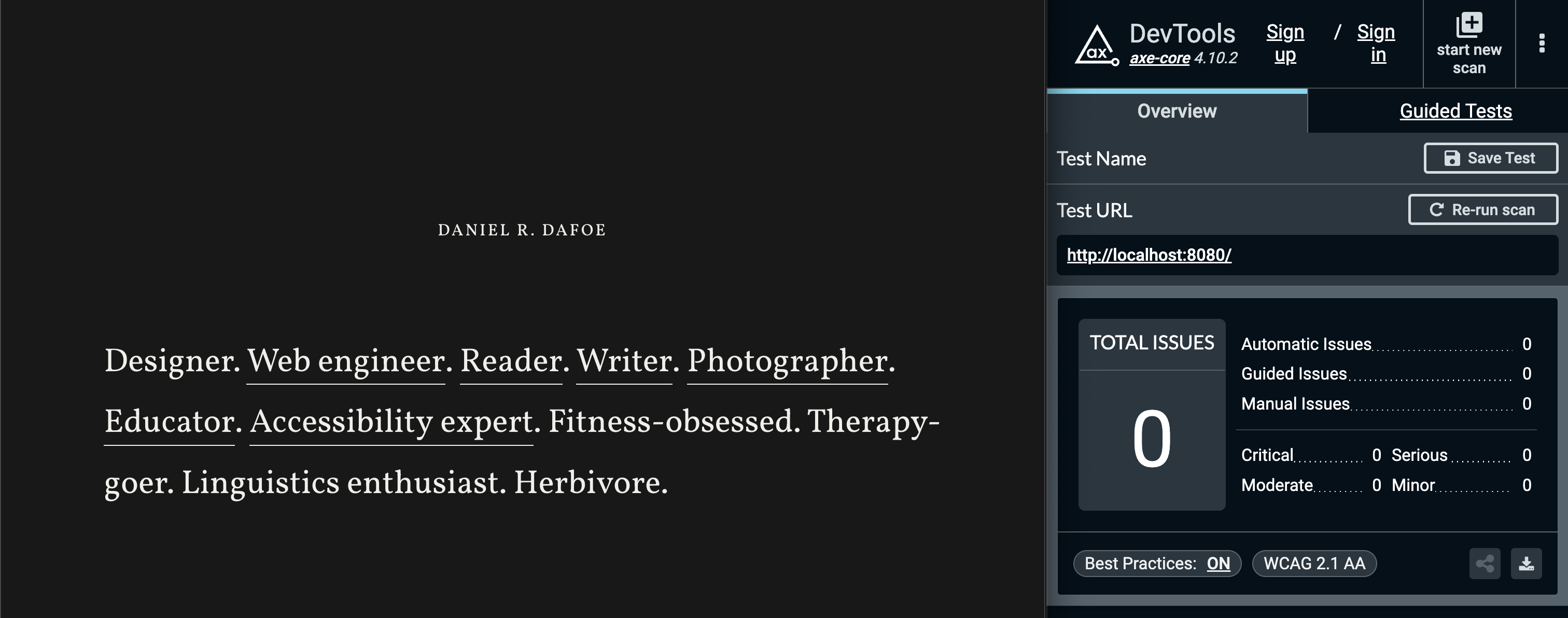
So why was I upset about my VoiceOver experience? Axe said I was good to go, so I must be, right?
My issue was not something automated tools are going to catch: it was a failure of the actual user experience.
Enter: actual user experience
You see, while using VoiceOver on the landing page of this website, I noticed after each link that I could navigate to an item that announced nothing at all. Here's a brief transcript:
VoiceOver: "Designer" VoiceOver: "link, Web Engineer" VoiceOver: "" VoiceOver: "link, Reader"
After a quick debug, I saw in the VoiceOver caption panel the culprit for the silent item: a period. It turns out my decision to leave each period outside the anchor tag caused them to be picked up by VoiceOver as a separate text node inside the paragraph. VoiceOver then attempted to announce the periods. Cool.
Had I not tested my page, I wouldn't have known about the negative impact I caused.
How to measure "actual user experience"
My tale of woe illustrates that you cannot rely on semantic markup and automated testing alone. While I strongly encourage you to do both of those things since they will lessen the likelihood of issues, they must be complemented with human-controlled validation to ensure great user experiences.
Why? Automated tools catch issues that are programmatic in nature: is there a label for this, does this element have a child element of that, does this element have that attribute. Things of that sort.
While automatic accessibility testing is a boon for identifying simple issues, it does not know what it's like to go through a web page holistically using assistive technology. Some issues require a warm-blooded, carbon-based life form like yourself to encounter them and have a subjectively poor experience when you do.
For examples of things automated testing can't catch because it doesn't experience things, check out Automated Accessibility Tests Aren't Human.
So how do you measure the actual user experience? Use your website. And I don't mean just using it how you normally use it. You need to go beyond your own biased way of browsing the web.
Here's an appetizer of nonautomatic scenarios to run against your website or mobile app:
- What's it like to use your experience with only a keyboard?
- What's it like to use your experience at 200% zoom?
- What's it like to use your experience using voice commands?
- What's it like to use your experience in grayscale?
While your validation of these scenarios may not be as thorough as someone for whom these are required, trying to get an understanding of what the experience is like is a great starting place.
Solving the problem
Now that I experienced what someone would potentially experience when visiting my site, I had to fix it. I don't want anyone to have a subpar experience.
I thought of a couple ways to solve this problem: include the period as part of the link label, or hide the periods with some ARIA attributes.
Aesthetically, I wasn't about to put a period as part of a link label, so that was out of the question.
I also wasn’t thrilled about adding extra bytes just to hide full stops, but I did it anyway. The extra 200 bytes to improve UX and keep my design were worth it.
Solution dilemma
After implementing my additional 200 bytes of HTML, I went back to testing my experience. Rejoice! The screen reader experience was saved.
But what about Hover Text? Well, let's have a look.
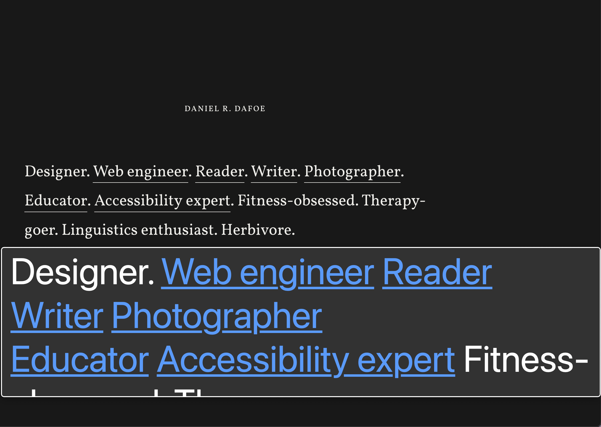
Hover Text, due to the <span> elements with aria-hidden="true" set on them, ignores rendering the periods inside the viewer window.
People using Hover Text don’t see an exact representation of the content, but in this case, the missing periods don’t affect comprehension.
You could argue that, cognitively, the periods give indication of where sentences begin and end, but I feel the separate words each having their distinct underlines and colour change even in the Hover Text viewing window is sufficient for understanding.
The takeaway
Creating great experiences for everyone requires verifying what the experience is like—including with accessibility features turned on.
Ideally you're also hearing thoughts from real people, but that's a soapbox for another day.